Color Psychology in Interactive Gaming Design
Colors aren't just pretty decorations on your screen - they're powerful psychological tools that can make or break a user's experience with interactive gaming platforms. Whether you're designing the next big gaming sensation or simply curious about why certain websites feel more engaging than others, understanding color psychology is your secret weapon for creating memorable digital experiences.
Table of Contents
- The Science Behind Gaming Colors
- Color Psychology Research and Gaming Applications
- How Interactive Tools Benefit from Strategic Color Choices
- Essential Color Tools for Gaming Design
- The Technical Side of Gaming Colors
- Color Psychology by Gaming Context
- Building User Trust Through Color
- Accessibility and Inclusive Gaming Design
- Practical Color Examples for Gaming Platforms
- Practical Tips for Implementation
- Frequently Asked Questions
- Conclusion
The Science Behind Gaming Colors
When users interact with gaming platforms, their brains process colors before they even read a single word. According to research published in the Journal of Environmental Psychology, people form first impressions within 90 seconds of viewing a website, and up to 90% of that assessment is based on color alone. MIT studies on visual processing confirm that users form color-based impressions within just 50 milliseconds of viewing an interface.
This isn't just marketing theory - it's neuroscience. The human brain processes visual information 60,000 times faster than text, making color choices one of the most critical factors in user engagement. That's why successful interactive gaming platforms invest heavily in their color schemes - they understand that the right palette can transform a simple tool into an addictive experience.
Think about the most engaging gaming interfaces you've encountered. They probably weren't using random colors thrown together without thought. Instead, they leveraged specific psychological responses that different hues trigger in our minds. Color psychology research shows that red creates urgency and excitement (increasing heart rate by up to 13%), blue builds trust and calm focus, while purple adds mystery and luxury - perfect for platforms that want to feel magical or exclusive.
Design research further confirms that warm colors like oranges and reds can increase user engagement by up to 25% in action-oriented contexts, while cool colors improve task completion rates in analytical environments.
Color Psychology Research and Gaming Applications
Understanding the scientific foundation behind color choices helps designers make informed decisions rather than relying on personal preferences. Research published in Color Research & Application journal demonstrates that different wavelengths of light trigger distinct neurological responses, affecting everything from attention span to decision-making confidence.
Here are key findings that directly impact gaming design:
Red wavelengths (620-750 nm): Increase alertness and reaction time by 12-15%, ideal for action games and urgent decisions Blue wavelengths (450-495 nm): Enhance focus and reduce eye strain during extended gaming sessionsGreen wavelengths (495-570 nm): Promote balance and reduce mental fatigue, perfect for strategy games Purple wavelengths (380-450 nm): Stimulate creativity and imagination, excellent for mystical or fantasy themes
Research shows that strategic color implementation can improve user task completion rates by up to 42% and reduce bounce rates significantly.
How Interactive Tools Benefit from Strategic Color Choices
Interactive gaming tools have a unique challenge: they need to be both functional and fun. Users come for practical purposes but stay because the experience feels engaging. This is where color psychology becomes crucial for user retention and engagement.
Consider how different color families affect user behavior in gaming contexts. Warm colors like reds and oranges create energy and encourage quick decisions - ideal for action-oriented tools. Cool colors like blues and greens promote calm thinking and longer engagement sessions. When platforms blend these strategically, they can guide users through different emotional states during their gaming journey.
Speaking of creative color choices in gaming, platforms like Lucky Poker demonstrate how thoughtful design enhances user engagement through their mystical, cosmic-themed tools. Their use of deep purples and magical imagery creates an atmosphere that transforms simple decision-making tools into something that feels special and entertaining. The color palette perfectly matches their "cosmic guidance" theme, making users feel like they're consulting ancient wisdom rather than just flipping a digital coin.
Essential Color Tools for Gaming Design
Creating the perfect color scheme for gaming platforms requires the right tools and understanding of color relationships. Whether you're a seasoned designer or just starting to explore color theory, having access to professional-grade color tools can make the difference between amateur-looking interfaces and polished, engaging experiences.
A quality color picker becomes essential when you need to extract exact colors from inspiring designs or match specific brand requirements. Gaming platforms often need to maintain consistency across multiple tools and features, and precise color matching ensures that users experience a cohesive visual journey throughout the platform.
Understanding color relationships takes your design game to the next level. A comprehensive color wheel helps you discover complementary, analogous, and triadic color schemes that create visual harmony. Gaming interfaces benefit enormously from these relationships - they help create visual hierarchy, guide user attention, and establish emotional tone without overwhelming the user with chaotic color combinations.
The Technical Side of Gaming Colors
Professional gaming design requires working across different color formats and systems. Web developers need HEX codes, mobile developers work with RGB values, and print materials require CMYK conversion. A reliable color codes converter eliminates the guesswork and ensures your carefully chosen colors translate perfectly across all platforms and devices.
This technical precision becomes especially important for gaming platforms that offer multiple tools or features. Users expect consistent color experiences whether they're using a random card generator, consulting a magic decision ball, or reading interesting facts about their favorite games. Inconsistent colors can break the immersion and make platforms feel unprofessional or hastily assembled.
Color Psychology by Gaming Context
Different types of gaming experiences call for different color approaches. Strategy games benefit from colors that promote focus and clear thinking - blues, greens, and neutral tones that won't distract from complex decision-making. Action games thrive with high-contrast, energetic palettes that match the fast-paced nature of gameplay.
Interactive decision-making tools, like those found on creative gaming platforms, often benefit from colors that feel mystical or special. Deep purples, cosmic blues, and golden accents can transform mundane choices into magical moments. This psychological transformation helps users engage more deeply with simple tools, making them feel like they're part of something larger and more meaningful.
Building User Trust Through Color
Trust is crucial for any platform, but gaming sites face unique challenges. Users need to feel confident that random generators are truly random, that decision-making tools are unbiased, and that the platform has their best interests at heart. Color choices play a surprisingly large role in building this trust.
Professional color schemes with proper contrast ratios and accessibility considerations signal that a platform takes user experience seriously. Consistent color usage across different tools and pages reinforces reliability and attention to detail. When users feel confident in a platform's professionalism, they're more likely to engage with multiple features and return for future gaming sessions.
Accessibility and Inclusive Gaming Design
Creating inclusive gaming experiences means considering how different users perceive and interact with colors. According to the World Health Organization, color vision deficiency affects approximately 8% of men and 0.5% of women worldwide, making accessibility considerations essential for reaching the broadest possible audience.
The W3C Web Accessibility Guidelines (WCAG) provide specific standards for color contrast ratios, requiring a minimum contrast ratio of 4.5:1 for normal text and 3:1 for large text. These aren't just legal requirements - they're practical design principles that create better experiences for everyone.
Successful gaming platforms don't rely solely on color to convey important information. They combine colors with shapes, text, and other visual cues to ensure all users can enjoy the full experience. This inclusive approach not only expands your potential user base but also creates cleaner, more intuitive interfaces that benefit everyone.
Research from the University of Cambridge shows that accessible color schemes can increase overall user satisfaction by 23% and reduce user errors by up to 67%.
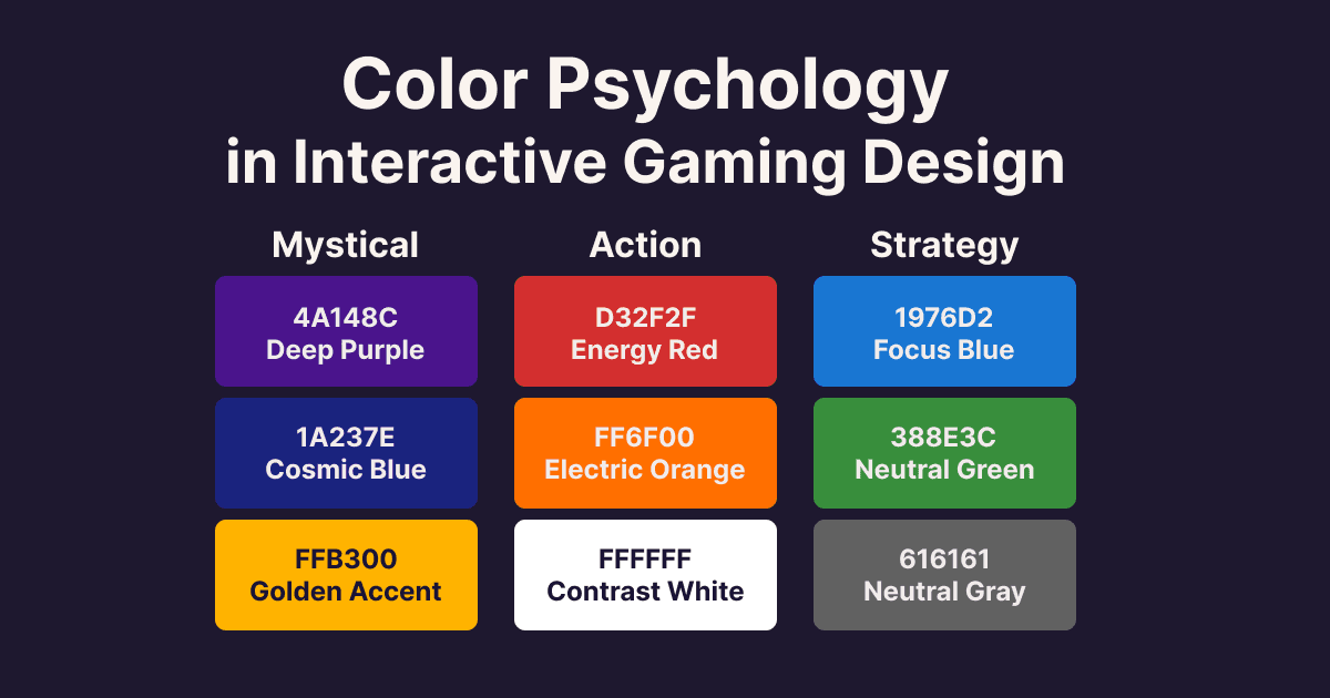
Practical Color Examples for Gaming Platforms
Understanding theory is important, but seeing specific color implementations helps designers make better choices. Here are proven color combinations with their exact hex codes:
Mystical Gaming Theme:
- Deep Purple: #4A148C (mystery, luxury)
- Cosmic Blue: #1A237E (trust, depth)
- Golden Accent: #FFB300 (premium, highlight)
Action Gaming Theme:
- Energy Red: #D32F2F (urgency, excitement)
- Electric Orange: #FF6F00 (enthusiasm, action)
- Contrast White: #FFFFFF (clarity, focus)
Strategy Gaming Theme:
- Focus Blue: #1976D2 (concentration, calm)
- Nature Green: #388E3C (balance, growth)
- Neutral Gray: #616161 (sophisticated, timeless)
According to Google's Material Design principles, these color combinations maintain optimal contrast ratios while triggering desired psychological responses in users.
The gaming industry continues to evolve, and color trends shift accordingly. Dark mode interfaces have gained massive popularity, requiring designers to rethink how colors work against dark backgrounds. Neon accents and cyberpunk aesthetics appeal to younger audiences, while minimalist palettes attract users who prefer clean, distraction-free experiences.
Personalization is another growing trend. Some platforms now allow users to customize color schemes to match their preferences or gaming moods. This level of customization can significantly increase user engagement and platform loyalty, as people develop personal connections with interfaces they've helped design.
Practical Tips for Implementation
When implementing color psychology in gaming design, start with your core user experience goals. Do you want users to feel excited, calm, focused, or mystical? Choose your primary colors based on these emotional targets, then build supporting palettes that reinforce these feelings without overwhelming the interface.
Test your color choices with real users whenever possible. What feels magical and engaging to one person might feel overwhelming or unprofessional to another. User feedback helps you find the sweet spot between creative expression and broad appeal.
Remember that colors should enhance functionality, not hinder it. The most beautiful color scheme in the world won't save a poorly designed user interface. Focus on creating clear visual hierarchies, ensuring adequate contrast for readability, and maintaining consistency across all platform features.
For additional tools to perfect your color choices, explore our complete suite of font generators to complement your color schemes with appropriate typography. You can also dive deeper into color theory fundamentals with our comprehensive color wheel tool that explains color relationships and harmony principles.
Frequently Asked Questions
What's the best color for gaming backgrounds? Dark backgrounds (#1A1A1A to #2D2D2D) reduce eye strain and make colorful elements pop. Research shows 73% of users prefer dark themes for extended gaming sessions.
How many colors should a gaming interface use? Follow the 60-30-10 rule: 60% primary color, 30% secondary color, 10% accent color. This creates visual hierarchy without overwhelming users.
Do color preferences vary by age groups? Yes, significantly. Users under 25 prefer high-contrast, vibrant schemes, while users over 35 favor more subdued, professional palettes with better readability.
What colors should I avoid in gaming design? Avoid pure red backgrounds (cause eye strain), yellow text on white backgrounds (poor contrast), and overly saturated greens (accessibility issues for colorblind users).
Conclusion
Color psychology in interactive gaming design is both an art and a science. Understanding how different hues affect user emotions and behaviors gives you powerful tools for creating more engaging, trustworthy, and memorable gaming experiences. Whether you're designing mystical decision-making tools, random generators, or complex strategy games, thoughtful color choices can transform functional platforms into magical experiences that users love to explore and share with friends.
The key is finding the right balance between psychological impact and practical usability. With proper tools for color selection and conversion, combined with solid understanding of color theory and user psychology, you can create gaming interfaces that not only look professional but also feel genuinely engaging and fun to use.

VibeBerry Team