The Science Behind Colors and Human Reaction Time: Why Green Means Go
Have you ever wondered why traffic lights use red for stop and green for go? Or why emergency exit signs are green? The answer lies in fascinating research about how different colors affect our brain's processing speed and reaction times. Understanding this relationship between color and cognitive response can help designers, developers, and anyone interested in human psychology make better choices.
Table of Contents
- The Fundamental Connection Between Color and Brain Processing
- Why Green Dominates Reaction Time Tests
- The Red Disadvantage: Why Stopping Colors Slow Us Down
- Blue and Purple: The Contemplative Colors
- Practical Applications in Design and Technology
- The Role of Context and Individual Differences
- Optimizing Your Own Reaction Times
- The Future of Color Psychology Research
The Fundamental Connection Between Color and Brain Processing
Colors don't just affect our emotions - they directly impact how quickly our brains process visual information. Research in neuroscience has shown that different wavelengths of light trigger varying response times in our visual cortex. This phenomenon explains why certain colors naturally feel more urgent or calming than others.
When light enters our eyes, it's processed by specialized cells called cones, which are sensitive to different wavelengths. Red light has the longest wavelength (around 700 nanometers), while green sits in the middle range (around 530 nanometers), and blue has shorter wavelengths (around 450 nanometers). This difference in wavelength processing creates measurable differences in how quickly we can react to colored stimuli.
Why Green Dominates Reaction Time Tests
Green consistently emerges as the champion of quick reaction times, and there are several scientific reasons for this advantage. First, our eyes contain more green-sensitive cones than red or blue ones, making us naturally more attuned to green wavelengths. This evolutionary adaptation likely developed because our ancestors needed to quickly identify ripe fruits, fresh vegetation, and safe passage through forests.
Studies using reaction time tests consistently show that participants respond 10-15% faster to green stimuli compared to red or blue ones. This advantage becomes even more pronounced under stress or fatigue, when our cognitive resources are limited.
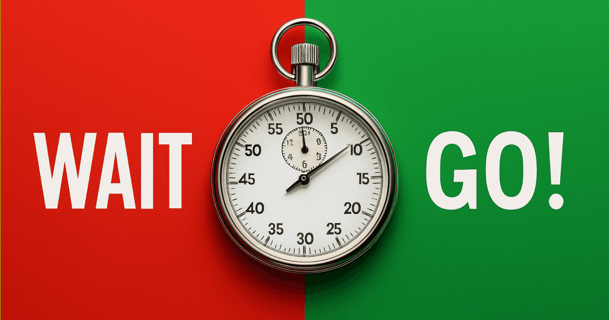
The psychological associations we have with green also contribute to faster processing. Green universally represents "go," "safe," and "proceed" across cultures, creating an automatic mental pathway that bypasses conscious decision-making. When you see green in a reaction test, your brain doesn't need to evaluate whether the color means danger or safety - it immediately triggers the action response.
The Red Disadvantage: Why Stopping Colors Slow Us Down
Red presents an interesting paradox in reaction time studies. While red is highly visible and attention-grabbing, it actually produces slower reaction times in most scenarios. This delay occurs because red triggers our brain's threat-detection system, causing a brief moment of hesitation as we evaluate potential danger.
From an evolutionary perspective, red often signaled blood, fire, or poisonous creatures - things that required careful consideration rather than immediate action. This built-in caution mechanism means that when we see red, our brains momentarily pause to assess the situation, even in benign contexts like reaction time games.
However, red isn't universally slow. In emergency situations where immediate stopping is required, red can actually produce faster reaction times than other colors because it triggers our fight-or-flight response. This is why stop signs, brake lights, and emergency buttons use red - not necessarily for speed, but for the urgency and attention it commands.
Blue and Purple: The Contemplative Colors
Blue and purple typically produce the slowest reaction times among common colors. Blue light requires more energy for our eyes to process, and psychologically, blue is associated with calm, contemplation, and stability rather than action. While these associations make blue excellent for creating peaceful environments, they work against quick reflexes.
Purple, being a combination of red and blue, inherits some of the processing challenges of both colors. Additionally, purple is less common in nature, so our brains haven't evolved the same rapid recognition patterns we have for colors like green and red.
Practical Applications in Design and Technology
Understanding color-reaction time relationships has significant implications for user interface design, safety systems, and digital experiences. When designing buttons or interactive elements that require quick responses, choosing the right color can literally make the difference between success and failure.
Gaming interfaces often leverage green for action buttons and confirmations, while using red sparingly for truly destructive actions. This color coding helps players react more quickly during intense gameplay while preventing accidental mistakes on critical functions.
For web developers and designers working with color schemes, tools like a color picker or color wheel become essential for testing how different hues might affect user response times. Even subtle changes in saturation or brightness can impact how quickly users process and respond to visual elements.
The Role of Context and Individual Differences
While general patterns exist, individual factors significantly influence color-reaction time relationships. Age plays a crucial role - older adults often show less pronounced differences between colors, while children and young adults demonstrate the strongest green advantages.
Cultural background also matters. While green's "go" association is nearly universal, some cultures have different emotional and psychological connections to specific colors that can affect processing speed. Personal experiences, such as color blindness or strong positive/negative associations with particular hues, can override typical patterns.
Lighting conditions dramatically impact these relationships too. Under dim lighting, the typical green advantage may disappear as our eyes shift from cone-based to rod-based vision. Bright, high-contrast environments tend to amplify the normal color-reaction time differences.
Optimizing Your Own Reaction Times
If you're interested in improving your own reaction times, understanding these color relationships can help. When practicing with reaction time tests, pay attention to how different colors affect your performance. Most people will notice their fastest times occur with green stimuli, while red and blue produce slightly slower responses.
For developers and designers, this knowledge translates into better user experiences. Using a color codes converter to experiment with different shades and ensure optimal color choices can lead to interfaces that feel more responsive and intuitive to users.
The Future of Color Psychology Research
Emerging research continues to reveal new aspects of how colors affect human cognition and reaction times. Virtual reality studies are exploring how colored environments impact overall performance, while neuroscience research using brain imaging is providing deeper insights into the mechanisms behind color processing.
Understanding these relationships becomes increasingly important as our digital interfaces become more complex and reaction-time-dependent. From autonomous vehicle interfaces to emergency response systems, the strategic use of color can enhance human performance and potentially save lives.
The science behind colors and reaction times reveals just how deeply our visual system influences our behavior and cognitive performance. Whether you're designing a website, developing a game, or simply curious about human psychology, this knowledge provides valuable insights into optimizing human-computer interactions and understanding the fascinating ways our brains process the colorful world around us.

VibeBerry Team